4.8 Three meanings of warm and cool
Yellows, oranges and reds are called warm, and greens, blues and violets cool, and every hue is said to come in warmer and cooler versions: a warm red leans toward orange, a cool one toward violet. The words carry real associations and are useful for talking about a picture. As a physical description of a color they have no fixed meaning, since three different versions are in use and they disagree. As a rule for mixing they are the bias rule of Section 4.5 under another name, with the same failures. A paint’s warmth is not even fixed. In Figure 34(b) the reds move toward violet by about thirty degrees of hue as white is added, and the blues toward green by about forty, phthalo blue by about sixty.
Figure 34(a) draws the three versions on the measured hue circle. The painters’ usual split puts the boundary between yellow-green and red-violet, with yellow, orange and red on the warm side and green, blue and violet on the cool. Itten, whose teaching fixed the modern usage, named red-orange the warmest hue and blue-green the coolest [37], which turns the boundary to run through the yellow-greens and the violets. The physicist’s version is color temperature, the color of a glowing body as it gets hotter: from the orange-yellow of a candle flame through the white of daylight to the blue of a clear sky. Placed on the hue circle with daylight as the white, that line runs from yellow-orange to violet-blue [78], some way off Itten’s axis at both ends. The three versions agree only that orange is warm and blue is cool. Under the usual split a lemon yellow is warm and a yellow-green cool. Under Itten’s a lemon yellow is nearer the cool pole than cadmium orange is. Under color temperature the warmest hue is a yellow-orange and the coolest a violet-blue, and a blue-green is neither.
Within a hue the words are relative, a cool red being one nearer violet than some other red. The split-primary palette uses them in this relative sense, so that its warm yellow is the one nearer orange and its cool blue the one nearer green, which is the bias rule tested above.
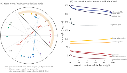
Figure 34. Warm and cool. (a) The calibrated paints’ tints at a lightness of 60 on the measured hue circle, with three warm-cool axes: the painters’ usual split, Itten’s axis from red-orange to blue-green [37], and the colors of a glowing body heated from 2000 to 20000 kelvin, drawn relative to daylight. (b) The hue angle of nine paints as titanium white is added by weight: the reds move toward violet, the blues toward green, the yellows toward green.
The second difficulty, in panel (b), is that the hue of a paint moves as white is added, for the reasons Sections 3.3 and 3.7 gave. Pyrrole red, an orange-leaning warm red straight from the tube, becomes a cool rose pink in a pale tint. Ultramarine, cobalt blue and phthalo blue all start as violet-blues in masstone and end as greener blues, phthalo blue as a green-blue. The usual split calls that cool to cool, while Itten’s axis calls it a move toward the cool pole and the relative usage a move from a warm blue to a cool one. Phthalo green goes from a blue-green to a green, and the two yellows move toward green as well. White brings back first the light a paint absorbs least (Section 3.7). For most paints that light lies on the cool side, so most paints cool as they are tinted, but the earths and green gold do not. The warmth of a paint has to be stated at a lightness to mean anything.
None of this makes the associations unreal. Warm and cool are tied to fire and sunlight on one side and to water, shade and distance on the other [37]. The blue of distant hills is a physical fact, the scattering of short wavelengths by the air, so the landscape painter’s rule that cool colors recede rests on something. The words do not, though, describe a measurable property of a pigment. Neither the eye’s color channels nor CIELAB nor Munsell has a direction that corresponds to warmth, and the Natural Color System, which was built from judgments of hue resemblance alone, found no need for one [29].
The nearest thing to a physical meaning is color temperature, and its line runs within thirty degrees of CIELAB’s yellow-blue axis, the eye’s yellow-blue channel. If warmth is anything measurable, it is how far a color sits toward yellow and away from blue. By that measure a lemon yellow is as warm as an orange, a magenta is cool, and a green and a red that sit equally far toward yellow are equally warm. That is not what the painter’s rule says, which is a fair sign that the rule is about something other than measurement. For mixing it is the bias rule again, and Section 4.5 has already given the verdict on that.
Sources
[29] A. Hård and L. Sivik, NCS, Natural Color System: a Swedish standard for color notation, Color Research and Application 6 (1981), 129–138.
[37] J. Itten, The Art of Color, Reinhold, 1961.
[78] G. Wyszecki and W. S. Stiles, Color Science: Concepts and Methods, Quantitative Data and Formulae, 2nd ed., Wiley, 1982.