4.7 Visual complements are not mixing complements
The wheel’s pairs across the center, red and green, yellow and violet, blue and orange, are taught as complements in every sense at once: each pair is supposed to give the strongest contrast side by side, to be each other’s afterimage (Section 1.5), and to mix to gray. With the calibrated paints the wheel’s pairs turn out to be fair mixing complements. The hue the eye sees as opposite, though, is usually a different paint, and the contrast and the afterimage go with that one. A single wheel cannot give both, because the eye sets one kind of complement and the spectrum of the paint sets the other.
The visual complement comes from the eye’s two color channels (Section 1.3). Two colors are opposite when they push both channels in opposite directions, which puts them on a line through gray on the color plane, half the circle of hues apart, to the accuracy with which CIELAB’s angles follow the eye. For pyrrole red that is a blue-green, where the wheel says green, because pyrrole red sits a little off the red end of the red-green axis, toward yellow. For hansa yellow medium, which sits close to the yellow end of the other axis, it is a blue, where the wheel says violet, and for cobalt blue it is a yellow, where the wheel says orange. Hering’s own pairs, red with green and yellow with blue, are the axes themselves, and they hold for the unique hues, not for every pigment that carries their names.
A mixing complement depends on two reflectance curves instead (Section 3.9). The partner must absorb where the paint reflects and reflect where it absorbs, band by band, with matched strength, and the spectrum knows nothing of the eye’s channels. For the blues the partner is an orange-brown, for the yellows a violet or a violet-blue, and for the greens a red-orange or a magenta-red. The wheel’s yellow and violet, and its blue and orange, come close to this, since a yellow’s neutralizer must reflect the violet-blue end of the spectrum alone and a blue’s the orange-red end alone. Its red and green come close too with these paints, since permanent green light absorbs the long half of the spectrum that pyrrole red reflects, but a green’s best neutralizer must absorb the middle of the spectrum, which a red does and a magenta does better. The two kinds of complement agree only where the eye’s axes and the halves of the spectrum happen to line up, as they do for magenta and green and for violet and yellow-green. Elsewhere they differ by as much as 55 degrees.
Figure 33 sets the three kinds side by side for six paints that stand for the wheel’s primaries and secondaries, with burnt sienna in place of the missing orange. Take hansa yellow medium. The wheel offers violet; the hue exactly opposite is a blue, nearest to cerulean; and the paint that brings it nearest to gray is dioxazine purple, a violet after all. Pyrrole red’s visual complement is a blue-green near phthalo green, while its mixing complement is permanent green light, the wheel’s own green, and cobalt blue’s visual opposite is a yellow, while its mixing complement is burnt sienna, the wheel’s orange. Only for dioxazine purple and permanent green light are the visual and the mixing complement the same paint, green gold for the first and quinacridone magenta for the second. The hues and proportions behind the figure are in the math box at the end of this lesson.
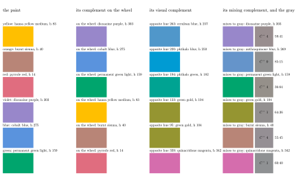
Figure 33. Three complements of six paints. Each row starts with the paint’s tint at a lightness of 60, then gives its complement on the artists’ wheel, shown as the paint standing for the opposite name; its visual complement, the calibrated paint nearest to the hue exactly opposite; and its mixing complement, the calibrated paint that brings it nearest to gray at the same lightness, with the gray it makes and the proportion by weight.
The wheel’s pairs were assembled from pigment practice as much as from theory. Chevreul’s law of simultaneous contrast, which says how a color looks changed by the colors around it, gave the wheel much of its authority, and it is about the visual relation [10]. The painters who used the wheel to kill a color with its opposite were using the mixing one. Albers, who had no use for the wheel, taught complements by trial, with pairs of actual colored papers [1].
Sources
[1] J. Albers, Interaction of Color, Yale University Press, 1963.
[10] M. E. Chevreul, De la loi du contraste simultané des couleurs, Pitois-Levrault, Paris, 1839.