3.1 Mixing lines
Mix two paints in equal steps by weight and the colors do not come out in equal steps. A tenth of phthalo blue stirred into hansa yellow medium takes the yellow from a lightness of 81 down to 41, and the other nine tenths of blue take it only to 24. The path from one paint to the other is not straight either. It bends toward gray, so the half-and-half mixture of two vivid paints can be dull, and a red and a blue can pass through a color with no hue at all on their way to each other. We call the series of colors between two paints their mixing line, and this lesson explains its shape.
Figure 13(a) mixes five pairs in steps of ten percent. With hansa yellow medium and ultramarine, the first tenth of blue makes more of the change than the next eight tenths together, and the greens after it grow darker and grayer as the blue goes in. Pyrrole red and ultramarine never pass through a violet. The red only darkens and dulls until, at nine parts blue to one of red, it is a dark gray, and the blue shows itself only at the last step. Quinacridone magenta and phthalo blue are dark the whole way, since both are dark in the tube. The one line that stays vivid in the middle runs from diarylide yellow to pyrrole red, two semi-opaque paints of neighboring hue. Both reflect the same long wavelengths, and they differ only in where their reflectance climbs from dark to bright.
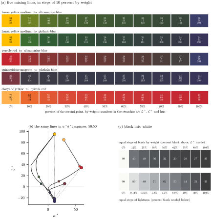
Figure 13. Mixing lines. (a) Five pairs of Golden paints mixed in steps of ten percent by weight, with the lightness, chroma and hue angle of each step. (b) The same five lines on the color map of Section 1.7; the dotted lines join each pair directly, and the squares mark the half-and-half mixtures. (c) Carbon black stirred into titanium white, in equal steps of weight and in steps that look equal in lightness, with the amount of black each of those steps needs.
Panel (b) draws the same lines on the color map of Section 1.7, where the center is gray and the distance from the center is chroma, each with a dotted straight line joining its two ends for comparison. None of the mixing lines follows its straight line. The two lines from yellow to blue bow outward through the greens compared with their straight lines, and that bow is what makes a green from a yellow and a blue possible at all. Every green on them is much duller than the yellow, and past the first few steps it is duller than the blue as well. The lines from red to blue and from magenta to blue cut straight through the gray center. The squares mark the half-and-half mixtures, and they sit far from the middle of their lines. Half hansa yellow medium and half phthalo blue lands two thirds of the way along, as a dark, grayish green.
Black stirred into white, in panel (c), is the plainest case. To make steps that look equal in lightness, each step needs about twice as much black as the one before. That comes mainly from the paint: near white, the first trace of anything that absorbs takes away far more light than any later addition does (Section 2.1), and the eye’s scale of lightness adds a little to it. The same steep start is why the first tenth of a dark paint counts for so much in the lines of panel (a).
To see where the rest comes from, recall what decides the color of a thick layer of paint. For each color of light, it is how strongly the paint absorbs that color compared with how strongly it scatters it back out. Color scientists write this ratio K/S, K for absorption and S for scattering, and a masstone shows a paint’s own K/S at every wavelength. When paints are stirred together, their absorptions simply add up, and so do their scatterings [22]. The mixture’s ratio is its total absorption over its total scattering, and that always lands somewhere between the paints’ own ratios. It is a kind of average, though not an average by weight. Each paint’s say in it is its share of the mixture’s scattering. A paint that scatters a lot gets a large say, and a transparent paint, which scatters little, gets a small one.
That small say does not make a transparent paint weak. In the colors it absorbs, its masstone is nearly black, so its own K/S there is enormous, and a small share of something enormous is still large. It comes down to how strongly the paint absorbs per gram, set against all the scattering in the mixture, and that is its tinting strength. Phthalo blue absorbs red light very strongly per gram and, in the middle of the spectrum, scatters about a hundredth as much as the white, so a tenth of it takes hansa yellow medium to a lightness of 41. Ultramarine absorbs less per gram and scatters more, and a tenth of it takes the same yellow only to 51.
Mixing lines bend toward gray for a related reason. In the colors that one paint absorbs and the other reflects, the mixture takes on some of the absorption. Each paint’s bright colors are dimmed by its partner, so the mixture is duller than a color halfway between the two. The less the two paints reflect in common, the deeper the sag. A red and a blue from opposite sides of the hue circle share almost nothing, and their line runs right through gray, as pyrrole red and ultramarine did above. Why no choice of color coordinates can straighten these lines is taken up in [49].
Because the mixture’s K/S is an average, it never goes outside the range of the paints’ own. Part 4 relies on this, and a second consequence, about scattering, goes with it.
The reason for the second half is simple. If the two paints have the same masstone, the one that scatters more also absorbs more per gram, in the same proportion, so a gram of it carries the absorption and the scattering of several grams of the weaker one. Any mixture made with the strong paint can be made with the weak one by using more of it. Paints whose scattering is spread differently across the spectrum are another case, and their mixtures can differ in color. The math box at the end of this lesson writes the mixing law in symbols and does the algebra behind the fact.
Try it
Mix two paints and watch the line. The swatches run from all of one paint to all of the other in steps of ten percent by weight; tick the box to add an equal weight of white.
Sources
[22] D. R. Duncan, The colour of pigment mixtures, Proceedings of the Physical Society 52 (1940), 390–401.
[49] M. Menke, Can color mixing be perceptually uniform?, preprint, October 2026.