3.8 The split-primary palette tested with measured paints
Many painting books teach a palette of six paints, a warm and a cool version of each primary: a lemon yellow and a deeper, more orange yellow, an orange-red and a cooler magenta-red, a violet-blue and a green-blue. The idea behind it is that no paint is a pure primary. Each one leans, or is biased, toward one of its neighbors on the color circle, the lemon toward green and the deep yellow toward orange. To mix the cleanest green, the rule says, take the yellow and the blue that both lean toward green; the yellow and the blue that lean away from it will give mud. The same goes for the oranges and the violets, the other two secondary colors. The palette and its rule are set out by Wilcox [75, 76] and taught, with variations, in many manuals [28]. MacEvoy and Briggs have both kept the palette while criticizing the explanation [48, 5].
Tested with the calibrated paints, the rule comes out partly right. With the palette’s own six paints it gets the order right every time. With other paints from the same families it often does not, because a paint’s lean is not what decides its mixtures. What decides them is how much light the two paints both reflect in the part of the spectrum the mixture needs, together with three properties the lean does not show: how dark each paint is, how strong it is, and how much of the mixture’s scattering it supplies. A lean predicts mixtures only when the paints compared are alike in those three; in the palette’s six, the lean and those three happen to point the same way.
The rule is easy to test with the model. Golden makes paints that fit the palette, and all six are among the calibrated paints: hansa yellow medium and diarylide yellow as the cool and warm yellows, pyrrole red and quinacridone magenta as the warm and cool reds, ultramarine blue and phthalo blue (green shade) as the warm and cool blues. For each secondary there are four ways to choose one paint from each of the two families it is mixed from. Each pair is mixed in every proportion, each mixture is lightened with white to the same lightness, and the one that lands on the chosen green, orange or violet is kept. Its chroma is the most vivid color that pair can make there. The targets, every chroma behind this section and the counts of the wider test below are in the math box at the end of this lesson.
With these six, the two paints that lean toward a secondary make the most vivid one every time, and for greens the gap is large: hansa yellow medium with phthalo blue makes a green nearly four times as vivid as diarylide yellow with ultramarine, which is the mud the rule promises. The sizes of the gaps say more than the rule does, though. In the greens, changing the yellow makes at least as much difference as changing the blue. In the oranges, changing the yellow makes a little more difference than changing the red. In the violets the red decides almost everything: quinacridone magenta makes a vivid violet with either blue and pyrrole red a dull one with both, and phthalo blue, the rule’s own example of a blue that cannot make a violet, does about as well as ultramarine. The oranges never turn to mud. Hansa yellow medium with quinacridone magenta, the pair that leans away, still reaches two thirds of the chroma of the best pair. The Color Nerd channel tested the palette with real watercolors in the pigments of Wilcox’s own palette and found the greens and violets behaving as the rule predicts and the two oranges nearly alike [15]; the model puts the oranges further apart than that.
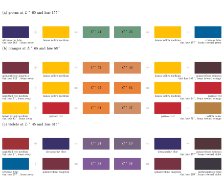
Figure 20. The split-primary rule tested with other paints from the same families. Each row compares two paints of one family, each mixed with the same partner. On the left are the paint that leans away from the secondary, its partner and their mixture; on the right are the mixture made by the paint that leans toward the secondary, its partner and that paint, so that the two mixtures sit side by side. The label under each paint gives its lean, the hue of its tint, relative to the other paint in its row. Each mixture is the most vivid one the pair can make at the target hue and lightness, and its chroma is written on it. In three rows the paint that leans away wins, by 5 to 27 units; in the other three the two mixtures are within a unit of each other, where the rule predicts a clear difference.
The trouble is that the six are chosen to agree with the rule. In each family the paint that leans toward a secondary also tends to have one of those three properties on its side, so its lean and its other properties point the same way, and a test with these six cannot tell which of them does the work. To pull them apart, the lean needs a number. The natural reading of the rule’s words is the hue of the paint’s tint, the paint mixed with white to a middle lightness, read as an angle round the color circle of Section 1.7. On that circle zero degrees is a pinkish red. Quinacridone magenta’s tint lies on the violet side of it, so the magenta leans toward violet; pyrrole red’s lies well on the orange side, so it leans toward orange. A lean is also relative. Quinacridone crimson lies between quinacridone magenta and naphthol red, so it leans toward orange beside the magenta and toward violet beside the naphthol, and Figure 20 labels it each way in different rows.
With a number for the lean, the test can take every two paints of a family, mix each with the same partner, and ask whether the one that leans toward the secondary makes the more vivid mixture: two reds, each with the same yellow, for an orange, or two blues, each with the same yellow, for a green. Among the more vivid paints of each family the rule usually picks the better mixture or comes out even, and the paint that leans away wins only a few times. The earths and Payne’s gray do worse. They lean mostly by being dark and dull, and they go against the rule about half the time. Figure 20 collects six cases: three where the paint that leans away makes the more vivid mixture, and three where the rule predicts a clear difference and the two mixtures come out the same.
Quinacridone crimson leans further toward orange than quinacridone magenta does, yet with hansa yellow medium the crimson makes the duller orange. An orange at this lightness is mostly yellow, and the red’s job is to take out the yellow’s reflection of green without darkening its orange and red. The two quinacridones absorb green equally well. They differ at the two ends of the spectrum. The crimson leans toward orange because it reflects a little less violet than the magenta, but it also reflects only a third as much red, and red light is what an orange needs. Its mixture comes out darker, needs more white to reach the target lightness, and loses chroma to the white.
Red oxide, which the wider test includes though the figure does not, is the most orange-leaning of the reds with any real color, and it makes a duller orange still, for a different reason: it is opaque. Section 3.2 showed that each paint in a mixture counts, color by color, in proportion to its share of the mixture’s scattering. Red oxide does nearly all of the scattering in the red and most of it in the orange, so the orange and red light that comes back from the mixture is mostly red oxide’s own, and red oxide’s own is dull. Naphthol red medium and pyrrole red, two vivid reds whose tints lean quite differently, make the same orange. So little of either is needed that its lean hardly enters, and the two absorb green about equally.
Yellow ochre goes wrong through darkness. It leans as far toward orange as diarylide yellow, but with pyrrole red it makes an orange about half as vivid, duller even than hansa yellow medium’s. Ochre leans toward orange because it is dark: it reflects only about half as much orange and red light as hansa yellow medium. Its mixture with the red is too dark for the target and needs white, which costs chroma, while the diarylide mixture needs none. The ochre’s lean is not even a fixed property of the tube. Its deeper tints lean toward orange and its pale ones toward lemon, the hue shift with white of Section 3.7 in another guise.
For violets the reds go wrong in the opposite direction. Quinacridone crimson leans further toward violet than naphthol red medium, yet with ultramarine it makes the duller violet, and it does the same with cobalt blue. A violet needs the red paint’s red light as much as the blue paint’s blue, because a mixture keeps only the light that both of its paints reflect. The crimson reflects no more violet than the naphthol does. Its tint looks cooler because it absorbs more of the orange, and absorbing more of the orange and the red also makes it the darker paint. A red leans toward violet by absorbing orange, and the more it absorbs, the darker and duller the violet it makes. Quinacridone magenta, which really does reflect some violet light, makes the most vivid violet of the four reds.
Among the blues, cerulean, which leans toward green, makes a green with hansa yellow medium barely more vivid than ultramarine’s, though ultramarine leans toward violet. The lean is true to the curve here, since cerulean does reflect more green light. But cerulean is a grayish paint, and the mixture that reaches the target green is mostly cerulean, so it can be little more vivid than the cerulean itself. Phthalo blue makes a green far more vivid than either because it is so strong. A small amount is enough to take out the yellow’s red, that small amount does hardly any of the scattering, and the green that comes back is mostly the hansa yellow’s own.
In a violet the blue’s lean hardly matters. Cerulean and anthraquinone blue, one leaning toward green and the other toward violet, make the same violet with quinacridone magenta, and phthalo blue and ultramarine come close to it. The violet is about nine parts in ten magenta, and the blue’s only job is to take out the magenta’s red, which every one of these blues can do.
Among the more vivid blues the rule’s order does hold for greens. Apart from ultramarine, which beats cobalt blue by three units, no blue that leans further toward violet makes a better middle green than one that leans further toward green, and the yellows make greens in the order of their lean, from green gold, the most vivid, through hansa yellow medium and diarylide yellow down to the earth yellows. A yellow’s reflectance curve is a single step, low at the violet end and high at the red end, and where the step falls sets both its hue and how much green light it reflects, so for a yellow the lean reads the curve directly.
A lean is one number read off a curve, and a mixture depends on the whole of both curves: in each part of the spectrum it is bright only if both paints are at least partly bright there and neither has a large say through its opacity. The Color Nerd channel gives painters a related rule of thumb: mixtures across the circle bend toward green, because the middle of the spectrum is where the eye is most sensitive and where the tails of most pigments’ curves overlap, so the greens a yellow and a blue can make depend on how much of the middle each one reflects [15, 16].
Sources
[5] D. J. C. Briggs, The Dimensions of Colour: Modern Colour Theory for Traditional and Digital Painting Media, http://www.huevaluechroma.com, 2007–2024.
[15] Color Nerd, Split-primary palettes miss this paint mixing insight, Color Wheel Wednesday, episode 29, video, 7 October 2026, https://www.youtube.com/watch?v=R0JkjnerdOw.
[16] Color Nerd, The real reason your palette has two of every color, Color Wheel Wednesday, episode 20, video, 23 July 2026, https://www.youtube.com/watch?v=bT7NNuENBOQ.
[28] J. Gurney, Color and Light: A Guide for the Realist Painter, Andrews McMeel, 2010.
[48] B. MacEvoy, handprint: colormaking attributes, color vision, the geometry of color perception, modern color models, color temperature, color wheels, the pigment guides, https://www.handprint.com/HP/WCL/wcolor.html, 1998–2023.
[75] M. Wilcox, Blue and Yellow Don’t Make Green, Artways, 1987; US edition Rockport, 1989.
[76] M. Wilcox, Getting the Most from the Wilcox Mixing Palette, School of Colour Publications, 2003.