4.1 What makes a paint a primary
Painters learn that red, yellow and blue are the primary colors: three colors that cannot be mixed from any others, and from which all the others can be mixed. The word primary is used for three quite different things, though, and the wheel runs them together. The eye has three kinds of cone, but the cones do not see three colors. Each responds to a broad range of wavelengths, and the one usually called the red cone is most sensitive to a yellow-green light. Perception has four hues that look like nothing but themselves, red, yellow, green and blue (Section 1.3), yet they are elementary only to the eye: a yellow paint cannot be mixed from a red and a green. At the palette, the first half of the painter’s definition is the useful one. A primary is a paint that nothing else on the palette can mix. The second half fails, since no three paints mix everything, and Section 4.3 measures how far short they fall. Nothing in the eye or in the paint singles out red, yellow and blue.
Each meaning has its own history. The cones are the primaries of physiology. Their sensitivities overlap so broadly that no wavelength excites only one kind, and their peaks lie in the blue-violet, the green and the yellow-green [70]. Young and Helmholtz called their three receptor processes red, green and violet, and the names stuck. They name the lights that excite each kind of cone most selectively, and say nothing about what the cones see [78].
The elementary hues are the primaries of perception. They are Hering’s four, which sit at the two ends of the eye’s two color channels, red against green and yellow against blue. Each has a partner it can never be seen together with, so there is no reddish green and no bluish yellow. Three of the four can be seen in light of a single wavelength, while a red that is neither yellowish nor bluish needs a little short-wave light added to the long end of the spectrum [32, 35]. Yellow counts as elementary in this sense even though the eye makes it from the sum of two cone signals. The Natural Color System is built on these four hues together with white and black, and has no notion of mixing at all [29].
The mixing primaries are a third thing again, and they depend on what is being mixed. For lights they are any three whose mixtures cover the most of the chromaticity diagram, the map of colors with their lightness taken out (Section 1.7), which for screens means a red, a green and a blue near the two ends and the middle of the spectrum [36]. Printing inks use a cyan, a magenta and a yellow, each of which absorbs one third of the spectrum and passes the other two. For paints, in this loose sense, a set of primaries is whichever three paints reach the most colors. Red, yellow and blue became the painters’ three in the eighteenth century, from Le Blon’s three-color printing and from the look of the pigments then available, before anyone had separated the three meanings [41, 6].
On the palette, a primary is simply a paint that nothing else there can mix. A paint can be mixed from a set of others only if its color lies inside the region their mixtures reach, and that region is limited. At every wavelength a mixture’s absorption divided by its scattering, the \(K/S\) of Part 2, lies between its ingredients’ values (Fact 3.2), so no spectrum outside their range can be mixed, even though a tint can be more vivid than the paint it came from. Section 4.3 searches fifteen colorful calibrated paints for the three that reach the most colors at a middle lightness, and finds hansa yellow medium, quinacridone magenta and phthalo blue. Figure 28 then checks the fifteen other calibrated single-pigment paints with some color against those three. That is a slightly different fifteen: it takes in the earths and chromium oxide, which the search left out, and leaves out green gold and permanent green light, which are mixtures of pigments. Seven lie outside the three’s reach: diarylide yellow, pyrrole red, naphthol red medium, dioxazine purple, ultramarine, cobalt blue and phthalo green. The furthest out is diarylide yellow, about twice as vivid as anything the three can mix at its hue and lightness. Of the eight that fall inside, four are earths, which are dull to begin with. Cerulean blue is inside because phthalo blue makes a better cerulean than cerulean is. Anthraquinone blue counts as inside only because the three come very close to it. The last two are quinacridone crimson and chromium oxide. Each of the seven is a primary in the sense that matters at the palette, and the math box at the end of this lesson gives the test and the numbers for every paint.
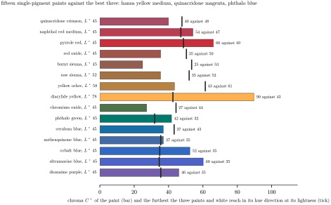
Figure 28. Paints that the best three cannot mix. Each bar is the chroma of one of the fifteen other calibrated single-pigment Golden paints with some color, taken at its own lightness, or tinted with white to a lightness of 45 if it is darker than that. The tick on each bar marks the furthest that hansa yellow medium, quinacridone magenta, phthalo blue and white reach in the same hue direction at the same lightness. A bar that passes its tick is a color the three cannot mix.
The number three came from the cones, and from the way lights mix. Grassmann showed in 1853 that lights mix by simple addition [26]. With the eye’s three kinds of cone, that means three well-chosen lights can match most colors, though no three can match them all. The number three was carried over to paint by analogy.
Sources
[6] D. J. C. Briggs, Colour wheels, in The Dimensions of Colour, http://www.huevaluechroma.com/061.php, 2017.
[26] H. Grassmann, Zur Theorie der Farbenmischung, Annalen der Physik und Chemie 89 (1853), 69–84.
[29] A. Hård and L. Sivik, NCS, Natural Color System: a Swedish standard for color notation, Color Research and Application 6 (1981), 129–138.
[32] E. Hering, Zur Lehre vom Lichtsinne, Gerold, Vienna, 1878; English translation Outlines of a Theory of the Light Sense, L. M. Hurvich and D. Jameson, trans., Harvard University Press, 1964.
[35] L. M. Hurvich and D. Jameson, An opponent-process theory of color vision, Psychological Review 64 (1957), 384–404.
[36] IEC 61966-2-1:1999, Multimedia systems and equipment. Colour measurement and management. Part 2-1: Colour management. Default RGB colour space: sRGB.
[41] R. G. Kuehni, Color Space and Its Divisions: Color Order from Antiquity to the Present, Wiley, 2003.
[70] A. Stockman and L. T. Sharpe, The spectral sensitivities of the middle- and long-wavelength-sensitive cones derived from measurements in observers of known genotype, Vision Research 40 (2000), 1711–1737.
[78] G. Wyszecki and W. S. Stiles, Color Science: Concepts and Methods, Quantitative Data and Formulae, 2nd ed., Wiley, 1982.