1.5 Adaptation
The light reaching the eye from a white sheet of paper is orange under a tungsten illuminant and bluish in the shade of a clear sky, yet the paper looks white in both. The visual system corrects for the color of the light by rescaling the three cone signals so that whatever is lighting the scene comes out neutral. The correction is nearly automatic and good, but not perfect: a vivid red looks somewhat different under tungsten light than in daylight even after the eye has adapted. The rescaling is set by the white, which sends back every wavelength. A red paint sends back only the long end of the spectrum, where tungsten’s extra light is greatest, so it gains more from the tungsten than the white does, and the correction cannot take all of that gain away.
The top row of Figure 5 shows seven Golden paints as they look in daylight. The middle row is the light they send back under a tungsten illuminant before any adaptation: everything has gone orange, the white included, which is what a camera with its white balance fixed for daylight would record. The bottom row imitates the eye’s correction by scaling three cone-like signals until the white comes out white again, a rule first proposed by von Kries. Most of the paints return close to their daylight colors, the white and yellow ochre to within less than two units of color difference. The reds and the deep green do not quite make it, and pyrrole red is still about five units away. The reds stay lighter and more orange, for the reason just given, while the green has lost some of the little blue light it had. The leftover change is called color inconstancy. It comes from the paint’s reflectance curve, and it is largest for vivid colors whose curves are least like the white’s.
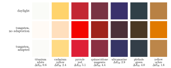
Figure 5. Adaptation to the color of the light. Top: seven Golden paints in daylight. Middle: the same paints under a tungsten illuminant, with no adaptation. Bottom: under tungsten after a correction of the kind the eye makes, rescaling three cone-like signals so the white is white again. The number under each column is the color difference between the corrected tungsten color and the daylight color: the part of the change that adaptation does not undo.
The correction takes time and is not complete. Most of it happens within a few seconds and the rest over a minute or two, and observers adapt most of the way to a colored light but not all of it, so a tungsten-lit room keeps a faint warmth even after a long stay [23]. The same correction also works on small parts of the visual field. Stare at a red patch and the L cones in that part of the retina turn down their sensitivity; look away at a white wall and the white looks greenish, which is the afterimage. A gray patch surrounded by a vivid color shifts toward the opposite hue, by a related mechanism that compares each region with its neighbors. These effects are large in a painting, where the “light” around a patch is whatever the painter has put there, and a mixed gray that measures neutral can look warm or cool depending on its neighbors. Measurements in these notes are all for isolated patches under daylight.
Sources
[23] M. D. Fairchild, Color Appearance Models, 3rd ed., Wiley, 2013.
[44] C. Li, Z. Li, Z. Wang, Y. Xu, M. R. Luo, G. Cui, M. Melgosa, M. H. Brill and M. Pointer, Comprehensive color solutions: CAM16, CAT16, and CAM16-UCS, Color Research and Application 42 (2017), 703–718.
[53] N. Moroney, M. D. Fairchild, R. W. G. Hunt, C. Li, M. R. Luo and T. Newman, The CIECAM02 color appearance model, in Proceedings of the IS&T/SID Tenth Color Imaging Conference, 2002, 23–27.
[73] J. von Kries, Theoretische Studien über die Umstimmung des Sehorgans, in Festschrift der Albrecht-Ludwigs-Universität in Freiburg, C. A. Wagner, Freiburg im Breisgau, 1902; abridged English translation, Chromatic adaptation, in D. L. MacAdam (ed.), Sources of Color Science, MIT Press, Cambridge, MA, 1970.