3.7 What white does to a hue
Nearly every paint changes hue when white is added, and which way it moves is decided by the pigment. Okumura measured tint ladders, a paint mixed with more and more white, for 26 Golden paints [59]. In them the organic reds swing toward magenta, the blues swing toward cyan, phthalo green turns from a blue masstone into a green tint, and dioxazine goes from a near-black to a violet. The yellows and the earths move the other way round the circle, toward yellow and yellow-green, and by much less.
White brings back the colors a paint absorbs in order of how strongly it absorbs them, the weakest first, and that covers all of these shifts. A pale tint therefore takes on the light that the masstone absorbed least, and its hue moves toward that color. For most pigments that color lies on the blue or green side of the paint’s own, and that is where the painter’s saying that white cools a color comes from.
The white adds a faint blue cast of its own, far too small to account for these shifts; the end of this lesson measures it.
Figure 19(a) is the measured evidence. For each paint Okumura measured, an arrow runs from the hue of the masstone to the hue of the palest tint. All the reds go toward magenta, the pink shift of the reds. All the blues go toward cyan, and phthalo blue goes furthest, 57 degrees. Its masstone measures as a violet-blue, for all that its name and its tint are greenish, and white turns it into a green-blue. The yellows and the earths go the other way. Red oxide, alone among the earths, turns toward red, and permanent green light does not move at all.
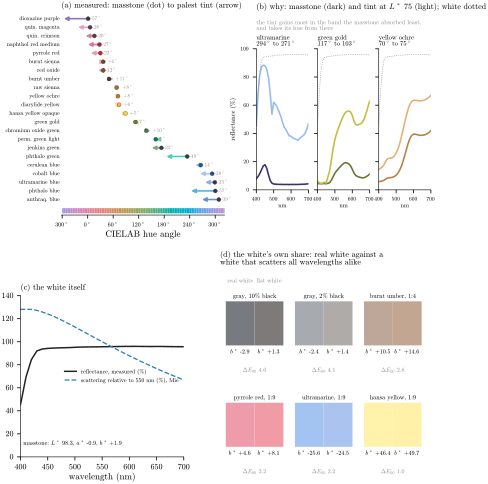
Figure 19. What white does to a hue. (a) Okumura’s measured tint ladders [59]: for each paint, an arrow from the hue of the masstone to the hue of its palest tint, with the shift in degrees; hues above \(320^{\circ}\) are drawn below zero so that the reds are not split at the top of the circle. (b) The cause, for three paints: the measured masstone and the modeled tint at a lightness of 75, with the white dotted. The tint gains most where the masstone absorbed least. (c) The white itself: its measured reflectance [71], and how strongly its particles of rutile, the form of titanium dioxide in the paint, scatter each wavelength compared with green light at \(550\,\mathrm{nm}\), calculated from the physics of small particles. (d) The white’s own share: six mixtures made with the real white and with an imaginary white of the same reflectance that scatters every wavelength equally, with the yellow-blue coordinate \({b^{*}}\) of each and the color difference between the two.
Panel (b) follows three paints that move three different ways. Ultramarine in masstone reflects a narrow band of blue and little else. Just beside that band, in the blue-green, it absorbs only moderately, while across the green, yellow and red it absorbs about five times as strongly. White lifts every color, but the moderately absorbed blue-green comes into view long before the rest, so the tint fills in toward green-blue while the red stays dark, and the hue moves toward cyan.
Green gold is a mixture of yellows with a little phthalo green in it, enough in a thick layer to take out the red and make the color an olive green. It absorbs the blue very strongly and the red only about a tenth as much. In a tint the red opens first, and by half white the red is as bright as the green while the blue is still dark, so the paint has become a yellow. Yellow ochre reflects the red almost fully and the yellow nearly so, and absorbs the green much less than the blue. The green opens next, and the ochre’s tint is a greener yellow than its masstone.
The weakest colors come back first because of the curve of Section 2.1. In a dark masstone, every color the paint absorbs strongly is close to black, however different their absorptions: a color absorbed ten times more is ten times darker, but both are near nothing. In a pale tint every color sits near the top of the curve, where a large difference in absorption becomes a much smaller difference in how far each color falls short of white. The tint squeezes the absorbed colors together, so the weakly absorbed ones gain on the strongly absorbed ones, and a pale tint shows the paint’s own color blended with its next-weakest one, in proportions the masstone never showed. The eye then gives extra weight to the blue end: as with the reds, a little added violet moves a color further on the color map than the same amount of added green.
The rule needs some care when it is read off a masstone. Where all of a paint’s absorbed colors sit on the surface floor of Section 2.2, as pyrrole red’s do below \(580\,\mathrm{nm}\), the masstone cannot say which of them is weaker, and only a tint ladder can. The model takes that information from the ladders of the calibrated paints (Section 2.6), and the paints without ladders, the cadmiums and the cobalt greens among them, are left out of the model for that reason.
Read family by family, the rule gives back the painter’s experience with the reasons attached. A red’s next-weakest color is the violet, so reds turn pink. A blue’s is the green side of its own peak, so blues turn toward cyan, and the phthalos, nearly black with a violet leak, swing furthest. A dark green such as phthalo green or jenkins green passes a narrow band of blue-green, and its tint fills in the green beside that band, so the blue masstone becomes a green tint; the ladder shows this, and the masstone alone, dark down to the surface floor on both sides of its band, cannot predict it. A yellow’s next color is the blue-green side of the step where its reflectance rises, so yellows turn toward lemon. The earths reflect red fully, yellow nearly and green a little, so their tints gain green before blue and move toward yellow, and green gold’s next color is the red, so it moves toward yellow too.
In the painter’s words most of these shifts are coolings and a few are warmings. The saying that white cools holds for the reds, blues, violets, yellows and dark greens, fails for the earths and green gold, and has not been measured for the cadmiums. The direction cannot be read from a hue name, only from the spectrum or from a ladder.
The white’s own share is small, and panels (c) and (d) measure it. Titanium white is very slightly yellow in the tube, because it absorbs a little of the violet [71, 25]. In a mixture it pushes the other way. Its particles scatter violet and blue light more strongly than red, and in a mixture the white’s scattering is what sends the light back, so a colorant’s absorption counts for less in the blue than in the red, and even a black that absorbs every color evenly gives a slightly bluish gray. Panel (d) makes six mixtures twice, once with the real white and once with an imaginary white of the same reflectance that scatters every color equally. The gray of ten percent carbon black is faintly blue with the real white and faintly yellow with the imaginary one, and tints of colored paints differ less. Okumura’s measured gray of carbon black in white is indeed a faint blue [59], though blacks have undertones of their own as well, mars black giving warmer grays than carbon black and the finest carbon blacks the bluest [8], and the tint ladders cannot separate the white’s share of a bluish gray from the black’s.
Either way the white’s effect is small. It moves a red or a blue tint by three to six degrees of hue and a yellow not at all, while the pigments’ own colors move tints by up to 57 degrees. The old description of titanium white as slightly yellow in the tube and mixing blue is true as far as it goes. What a painter sees when a red turns pink, a blue turns toward cyan or an ochre turns toward lemon is the pigment’s next color coming through, and any white would show it.
Sources
[4] C. F. Bohren and D. R. Huffman, Absorption and Scattering of Light by Small Particles, Wiley, New York, 1983.
[8] G. Buxbaum and G. Pfaff (eds.), Industrial Inorganic Pigments, 3rd ed., Wiley-VCH, Weinheim, 2005.
[21] J. R. DeVore, Refractive indices of rutile and sphalerite, Journal of the Optical Society of America 41 (1951), 416–419.
[25] Golden Artist Colors, Inc., Heavy Body Acrylics: Pigment Detail Chart, https://goldenartistcolors.com, 2025.
[42] R. Levinson, P. Berdahl and H. Akbari, Solar spectral optical properties of pigments, Part I: Model for deriving scattering and absorption coefficients from transmittance and reflectance measurements, Solar Energy Materials and Solar Cells 89 (2005), 319–349.
[43] R. Levinson, P. Berdahl and H. Akbari, Solar spectral optical properties of pigments, Part II: Survey of common colorants, Solar Energy Materials and Solar Cells 89 (2005), 351–389; the Lawrence Berkeley National Laboratory Pigment Database, https://coolcolors.lbl.gov/LBNL-Pigment-Database/database.html.
[56] Museum of Fine Arts, Boston, CAMEO: Conservation and Art Materials Encyclopedia Online, https://cameo.mfa.org.
[57] K. Nassau, The Physics and Chemistry of Color: The Fifteen Causes of Color, 2nd ed., Wiley, 2001.
[59] Y. Okumura, Developing a Spectral and Colorimetric Database of Artist Paint Materials, M.S. thesis, Rochester Institute of Technology, 2005, https://repository.rit.edu/theses/4892.
[71] L. A. Taplin and R. S. Berns, Art-SI Art Material Library: BYK-mac multi-angle spectral measurements, version 1.2, Munsell Color Science Laboratory, Rochester Institute of Technology, 2011.