3.4 Why transparent pigments gain chroma with white
Squeeze out quinacridone magenta, phthalo green or dioxazine purple and the paint looks almost black. Mix in some white and the color appears: quinacridone magenta, a dull dark red in the tube, turns into a vivid pink-red with nearly twice the chroma of the masstone. Keep adding white and the tint gets lighter but weaker, until it is a pastel. The color of these paints first rises and then falls as white is added. Opaque and light paints behave differently. Pyrrole red and hansa yellow medium are at their most vivid straight from the tube, and every addition of white makes them paler and duller.
The trouble with a dark transparent paint is that it absorbs too well. Quinacridone magenta absorbs green light strongly and red light only weakly, and that difference is what makes it a red. In a thick layer, though, even the weak absorption adds up. A particle of this pigment barely scatters, so the red light travels a long way into the paint before anything turns it around, and on that long trip a good part of it is absorbed as well. The masstone is very dark in the green and only part of the way up in the red, and with so little contrast between the two its color is muted.
White gives the light a short way back out. Its particles scatter strongly, so in a tint the light is turned around soon after it enters. The red light, which the magenta absorbs only a little, now comes back nearly whole. The green light is still mostly lost, because the magenta absorbs it so strongly that even a short trip is enough to remove it. Red comes back bright while green stays dark, and the eye reads that contrast as a vivid color.
Adding more white changes the balance. Once nearly all of the red is getting back out, more white cannot make the red any brighter; it can only let more of the green escape. As the green catches up, the contrast shrinks and the tint fades toward white. The color is most vivid in between, where the red has nearly reached its brightest and the green has barely begun to rise. For quinacridone magenta that happens at about one part white to two of paint.
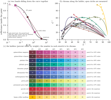
Figure 16. Why transparent paints are most vivid in a tint. (a) Two colors of quinacridone magenta on the curve of Figure 8(c): the red it passes (\(650\,\mathrm{nm}\)) and the green it absorbs (\(550\,\mathrm{nm}\)), in masstone, at equal parts with white, and at two percent paint. White moves both down the curve together, and the red reaches the steep part first. The horizontal scale is logarithmic: each labeled mark is ten times the one before. (b) Chroma against lightness as white is added to twelve paints; the open circles are Okumura’s measurements of real paint [59] and the triangles mark the most vivid tint. (c) The same tints as swatches, with the chroma of each.
On the curve from Section 2.1, which turns a paint’s absorption and scattering into the share of light it reflects, white moves both of quinacridone magenta’s colors down by the same factor, as Figure 16(a) shows. The red reaches the steep part first and rises quickly while the green is still on the flat tail; later the red has nowhere left to climb and the green starts to rise. Of the twelve paints in panels (b) and (c), nine rise and fall this way; pyrrole red, red oxide and hansa yellow medium are most vivid straight from the tube. It is not only a prediction of the model: Okumura found it in real paint for every transparent pigment he measured, with phthalo green, for instance, going from a chroma of 8 in masstone to 48 in its best tint [59]; Golden’s own drawdowns show the same thing, with its transparent paints showing their color in tints rather than in masstone [63].
How much white a paint needs before it peaks depends on how dark its masstone is, and the math box at the end of this lesson works out where the peak falls. Ultramarine, whose masstone still reflects some blue, peaks with only a little white, while the phthalos need about as much white as paint. A paint that already reflects nearly all of its passed light in masstone has no peak, or only a small one, because white can only raise the light it absorbs. That describes the light paints and most opaque ones: hansa yellow medium, which reflects most of the yellow and red light straight from the tube, fades from the very first addition of white.
A glaze behaves the same way. A thin layer of phthalo green over white is a vivid green and a thick one is nearly black, and the most vivid color is at some thickness in between, because thinning a layer, like adding white, weakens the absorption at every wavelength by the same factor. This is why the transparent paints that look black in the tube are the painter’s best glazing colors, and why a color chart of transparent paints has to show a tint or a glaze to show their color at all.
Try it
Add white to a paint and find its most vivid tint. The line is the model; the open circles are Okumura’s measurements of real paint.
Sources
[59] Y. Okumura, Developing a Spectral and Colorimetric Database of Artist Paint Materials, M.S. thesis, Rochester Institute of Technology, 2005, https://repository.rit.edu/theses/4892.
[63] S. Sands, The subtleties of color, Just Paint, Golden Artist Colors, 1 September 2009, https://justpaint.org/the-subtleties-of-color/.