3.9 A gallery of mixtures around the circle
The rest of this part is mostly pictures. Fourteen calibrated paints spaced around the hue circle, opaque and transparent together, are mixed in every pair. Sixteen pairs are followed from one paint to the other in steps of ten percent. And twelve paints are each tried against all the others to find the ones that mix them to gray. The pictures show the lessons of the earlier sections in a form a painter can consult at the palette, and they add a few of their own.
The first two pictures are grids (Figures 21 and 22). The fourteen paints run along both edges in order of hue, from hansa yellow medium through the reds, violets and blues to the greens, and each cell holds the mixture of the paint in its row with the paint in its column, with its chroma and hue. In the first grid the cells above the diagonal are half of each paint by weight, and the cells below are the same mixtures with two parts of white. The white is where most of the differences show. Many of the half-and-half mixtures are so dark that they look alike, and their colors come out only in a tint, for the reason Section 3.4 gave.
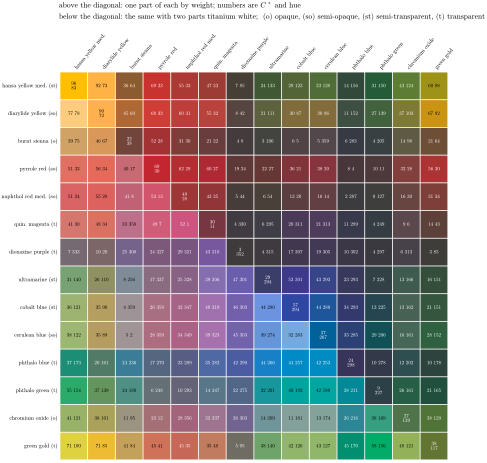
Figure 21. Fourteen paints around the hue circle. Above the diagonal every pair is mixed half-and-half by weight; below it the same mixtures have two parts of titanium white added. The diagonal holds the paints themselves, and each cell gives chroma and hue. Opacity ratings follow Golden’s chart [25].
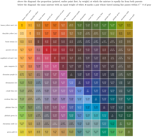
Figure 22. The same fourteen paints, each pair mixed in the proportion at which the mixture is as different from one parent as from the other, so that neither has won (above the diagonal, with the proportion printed, earlier paint first), and the same mixtures with an equal weight of white (below). A dot marks a pair whose tinted mixing line passes close to gray, within a chroma of 8.
Mixed by weight, the strong transparent paints take over whatever they are in. Half and half with diarylide yellow, phthalo blue gives a dark green and dioxazine a brown-gray. The second grid corrects for this. There each pair is mixed in the proportion at which the mixture is as different from one parent as from the other, the point where neither paint has won, and the proportion is printed in the cell. It runs from about equal for paints of similar strength, such as hansa yellow medium and cerulean, to almost all quinacridone magenta against a trace of phthalo blue. The proportions measure tinting strength, how far a gram of each paint goes in a mixture (Section 3.1). A painter who mixes by eye will use the phthalos and dioxazine in traces and cobalt blue and cerulean by the spoonful.
The lower triangles show what white does. In the hansa yellow medium row the greens gain from it, a few units of chroma with ultramarine, cobalt or cerulean and more than twenty with the two phthalos. Half and half with phthalo blue, the yellow makes a dark green, and white more than doubles its chroma, giving back light the dark blue would have absorbed. The red-oranges in the same row lose chroma with white. The quinacridone magenta and dioxazine rows are dark most of the way across in masstone, and they show their colors only in a tint, where some of their mixtures with the blues become clear violets and violet-blues.
A dot in the second grid marks a pair whose mixing line, with white, passes close to gray. The dots fall on pairs from opposite sides of the circle: burnt sienna with each of the four blues and with phthalo green, the reds and magenta with chromium oxide, hansa yellow medium with dioxazine, diarylide yellow with cobalt blue or cerulean, among others. Pairs that balance near equal weights and never pass through gray, such as hansa yellow medium with cerulean, are the ones a painter can mix by eye without surprises.
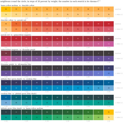
Figure 23. Eight pairs of neighbors going round the hue circle, mixed in steps of ten percent by weight. The upper row of each pair is the mixture; the lower row is the same mixture with an equal weight of titanium white, with its hue under every other step. The number in each swatch is its chroma.
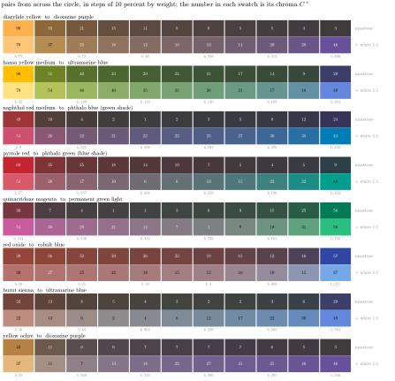
Figure 24. Eight pairs from across the hue circle, mixed in steps of ten percent by weight, in masstone and with an equal weight of white, as in Figure 23. The pairs pass through gray where the two reflectances no longer overlap.
Sixteen mixing lines, in Figures 23 and 24, follow pairs from one paint to the other, each in masstone and with white; the math box at the end of this lesson gives sample values from the grids and along several of the lines. Pairs of neighbors stay vivid; in masstone a dark transparent paint can take over a line, as phthalo green does when it goes into cerulean. Hansa yellow medium to diarylide yellow hardly dips. Diarylide yellow to pyrrole red drops by about a fifth at the first step and then holds. With white the hue walks evenly round the circle, from pyrrole red through the pinks to quinacridone magenta, or from dioxazine through the violet-blues to ultramarine. Pairs from across the circle dive toward gray instead. Hansa yellow medium to ultramarine passes through a run of greens, each duller than the last. Naphthol red medium with phthalo blue is close to gray by 30 percent blue. Burnt sienna with ultramarine, the painter’s classic gray, is nearly gray by the same point, and with white it runs from a warm gray to a cool one with every neutral in between. Yellow ochre with dioxazine gives a long run of browns and gray-violets.
These are the lines a painter uses for neutrals, and the figure shows where on each line the neutral sits. Two paints from opposite sides of the circle reflect different parts of the spectrum, so each absorbs most of what the other reflects. Somewhere along the line their reflections stop overlapping, no part of the spectrum comes back much brighter than any other, and the mixture is gray.
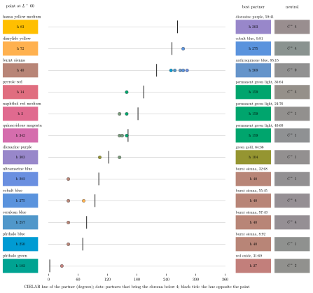
Figure 25. Mixing complements. Each of twelve paints, lightened with white to a middle lightness (\({L^{*}} = 60\)), was mixed in every proportion with every other colored calibrated paint at the same lightness. The dots on the hue scale mark each partner that brought the mixture nearly to gray, below a chroma of 4, and the black tick marks the hue exactly opposite the paint’s tint. On the right are the partner that came closest to gray, the neutral it made and the proportion.
The word complement means two different things. To the eye, the complement of a color is the hue directly across the color circle, the one the opponent channels of Section 1.3 treat as its opposite. To a painter it is the paint that mixes with it to gray. The search in Figure 25 finds the second kind. Each of twelve paints is lightened to a middle lightness, every other colored paint among the calibrated ones is tried against it in every proportion, and the partners that bring the mixture close to gray are marked on a hue scale, along with a tick at the hue exactly opposite. This test is stricter than the dots of the second grid, so its lists differ a little from the grid’s. A dot marks any pair among the fourteen whose tinted line comes within a chroma of 8 of gray; the search asks for a chroma below 4 at a fixed lightness and tries every colored calibrated paint as a partner.
The two kinds rarely coincide. Ultramarine’s visual opposite is a yellow, but the one paint that neutralizes it is burnt sienna, an orange-brown, at about one part blue to two of sienna. The other blues go the same way, cobalt, cerulean and phthalo blue all neutralized best by burnt sienna, and in return burnt sienna is neutralized by five of the blues. Diarylide yellow’s opposite is a middle blue, but its only neutralizer is cobalt blue, from the violet end of the blues, and it takes far more of the blue than of the yellow. No calibrated paint brings hansa yellow medium below a chroma of 4, though dioxazine comes close. Of these twelve, only quinacridone magenta and dioxazine, neutralized by greens close to their opposites, come near to agreeing with the eye. The misses have a direction. The blues’ partners lie toward red from the visual opposite, the yellows’ toward violet and the vivid reds’ toward yellow, and phthalo green’s partner, red oxide, lies toward orange.
The visual opposite comes from the eye’s color channels, while a mixing complement comes from two reflectance curves: to leave a gray, the partner must absorb where the paint reflects and reflect where it absorbs, with matching strength. A yellow reflects everything from green to red, roughly from 500 nanometers up, so its partner must absorb all of that and reflect only violet and blue. Most blue pigments do not. Cobalt and ultramarine reflect some green along with their blue, and phthalo blue a great deal of it, so a yellow mixed with a blue usually keeps the green they share and makes a green. Dioxazine reflects violet and blue and absorbs the rest, and it comes closest to neutralizing hansa yellow. Diarylide yellow, the more orange of the two yellows, has less green in its curve, and cobalt blue can neutralize it given enough. A blue, in turn, reflects from violet to blue-green with a small tail into the red. A yellow reflects the green part of that and so leaves a green. Burnt sienna absorbs all of it, and its own reflection in the red matches the blue’s tail. So a blue’s mixing complement is an orange-brown, a yellow’s is a violet or a violet-blue, and a green’s is a red-orange or a magenta-red. Magenta and green come near to agreeing with the eye because magenta reflects both ends of the spectrum and green the middle, so for this pair the halves of the spectrum line up with the eye’s opposites. Part 4 takes this to the color wheel, whose opposite pairs turn out to be fair mixing complements with these paints even though the hue the eye sees as opposite often belongs to another paint.
Sources
[25] Golden Artist Colors, Inc., Heavy Body Acrylics: Pigment Detail Chart, https://goldenartistcolors.com, 2025.